House of Lidl
Overview
My task was to create a visual refresh of the House of Lidl YouTube series, having 4 different categories each with its own custom color palette.
Visual Identity
Concept, Colors & Fonts
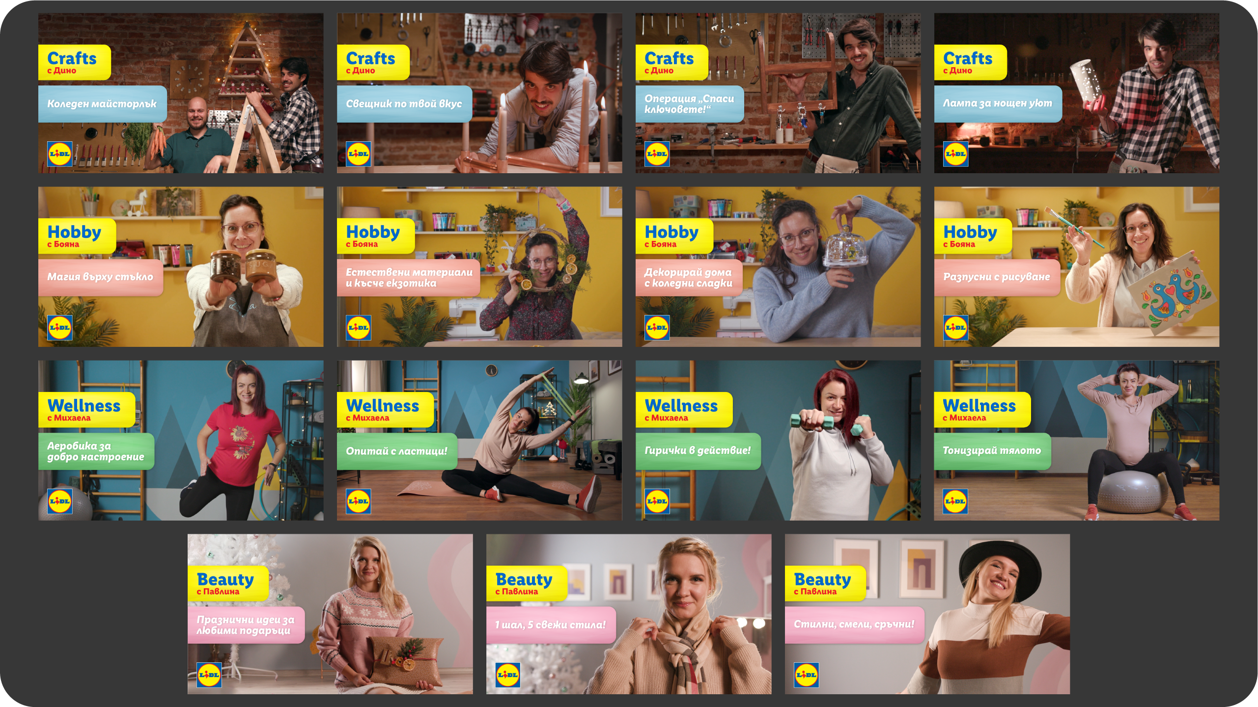
Steering away from the common simplified digital look, we are building brand new graphics that work with light, materials, depth and textures.
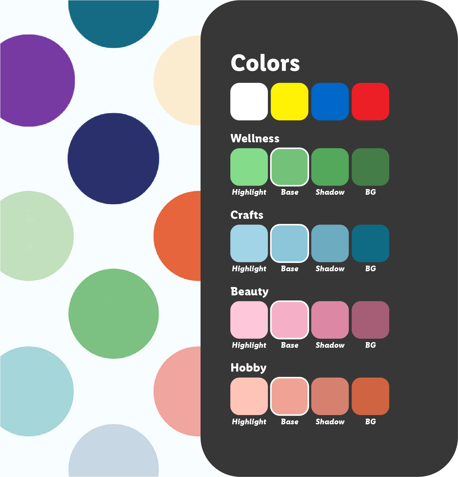
Each of the 4 categories are sharing the main Lidl blue and yellow colors, alongside their own custom palette, made out of Lidl’s secondary brand colors.
The series is using Lidl’s font family, with two different font weights – Bold for headlines and accents and Book for body.


Lighting, Materials & Textures
The graphics have a subtle highlight, mimicking a reflection from studio lights and cast a soft shadow underneath, that makes them more visible on top of the footage.
Additional soft material and a grain texture are added to blend the graphics more with the environment.

Graphics
Each category has its own unique graphic set.

Motion Graphics


Thumbnails

Diplomas
At the end of the project, we designed diplomas for the experts that hosted the episodes.


