Mitov Studio

Bible Reader App

A simple and clean reader for The Bible

December 2020

Overview

We are creating a simple reader that lets you read the Bible offline in multiple languages, customized for you. Our target audience is everyone that wants to read the Bible. We strive to create a simple solution available for everyone. To narrow things down, we picked three radically different types of people that represents our target audience.
Bible Reader App Target Audience

The Goal & Motivation

Our goal is to make the Bible available to everyone that has a phone. The app has a variety of customizations to suit everyone’s preferences – different font sizes and styles, background color and more. We asked people in our target audience groups what elements do they want and implemented every important aspect to achieve efficient reading.​​​​​​​
Bible Reader App Storyboard

User Experience

There’s something for everyone.
Bible Reader App User Experience

Sketches

Bible Reader App UX Sketch

Layout & Prototype

Bible Reader App Layout
Bible Reader App Prototype

The Design

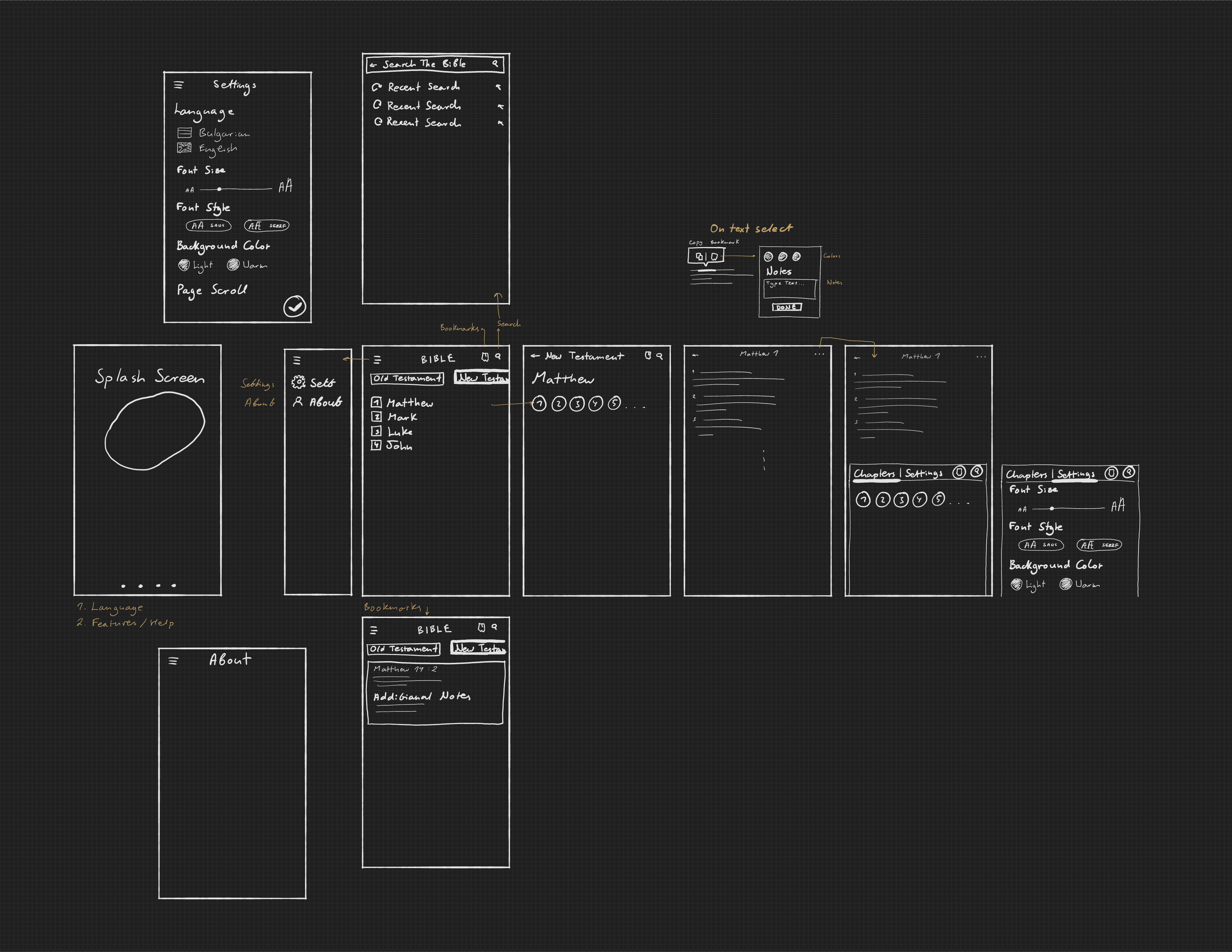
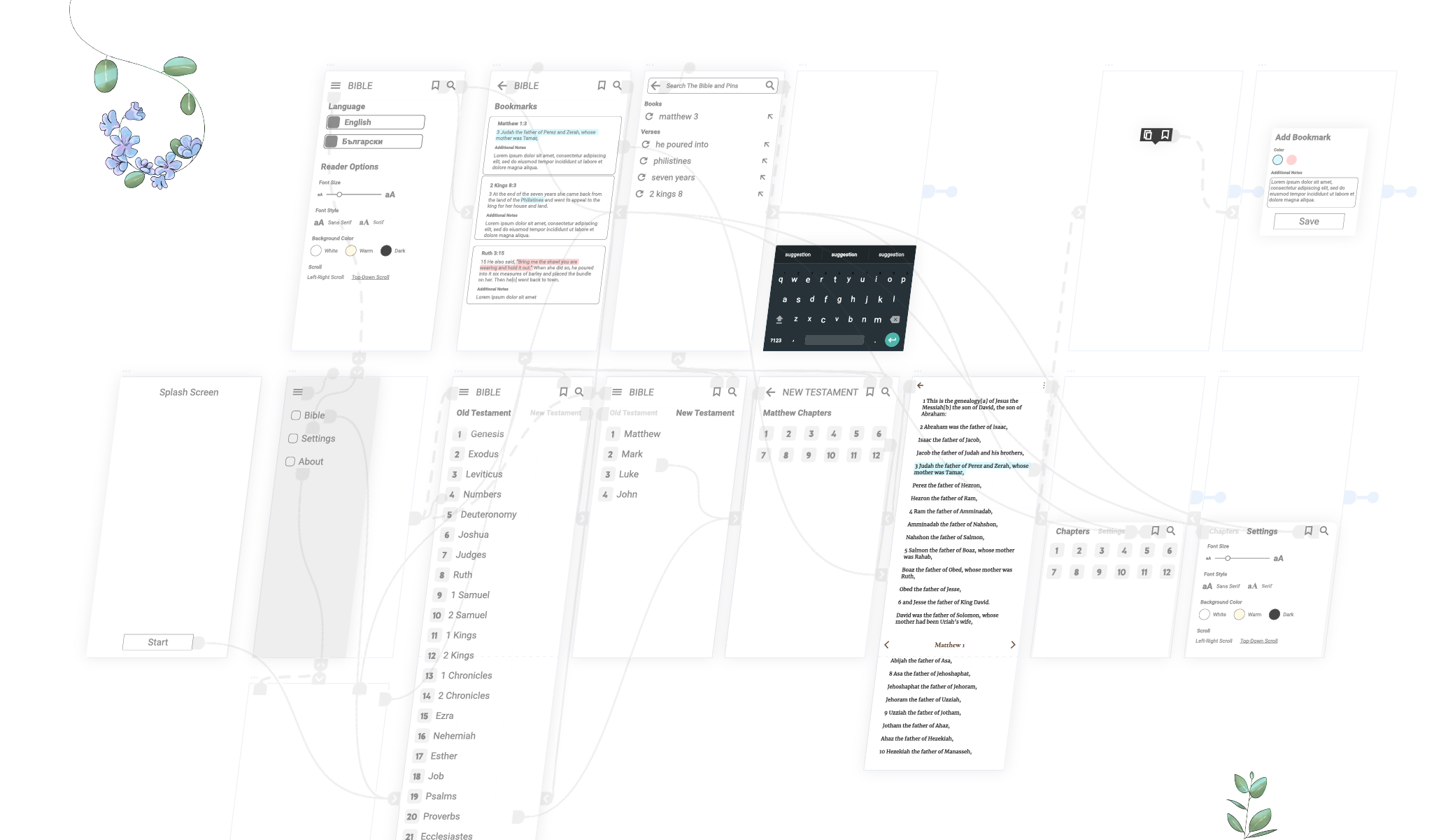
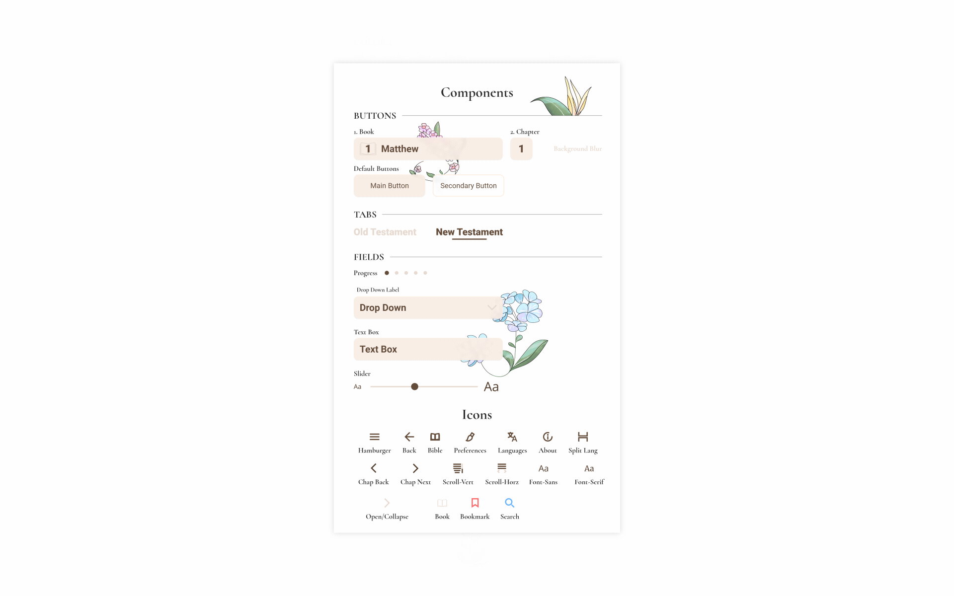
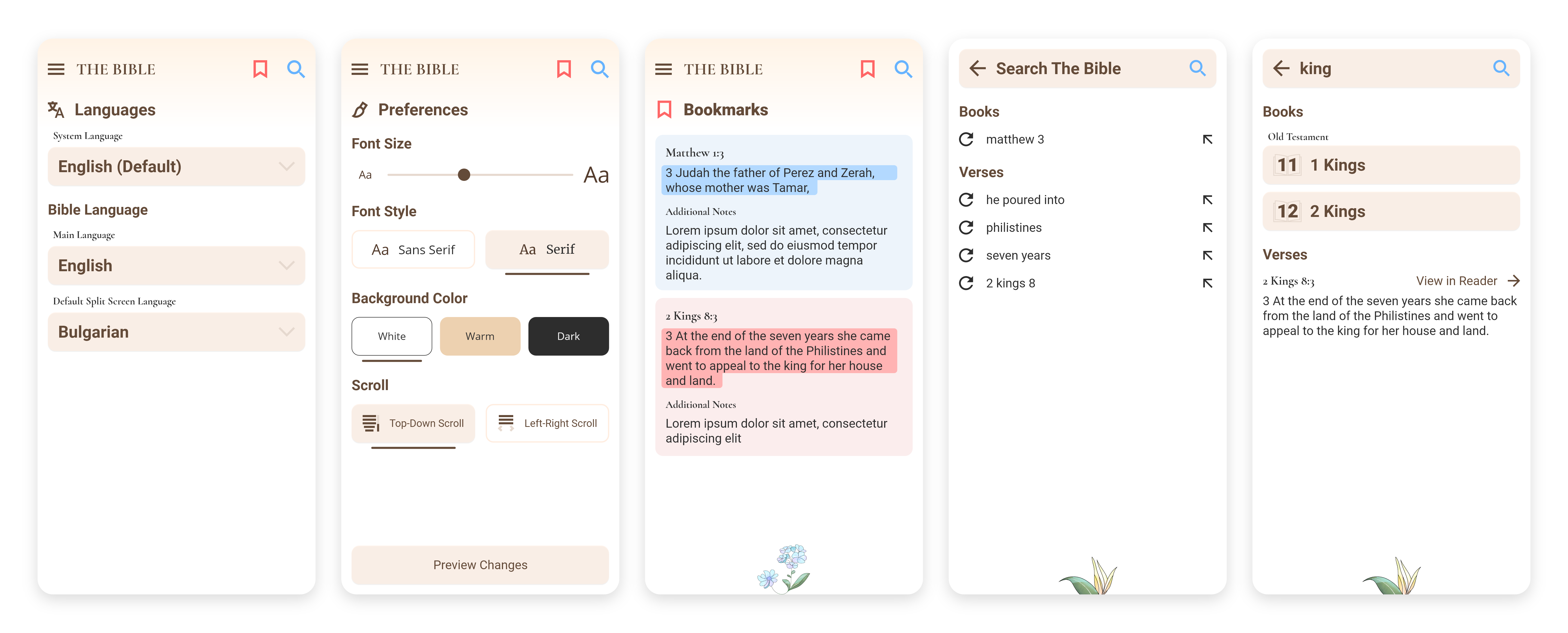
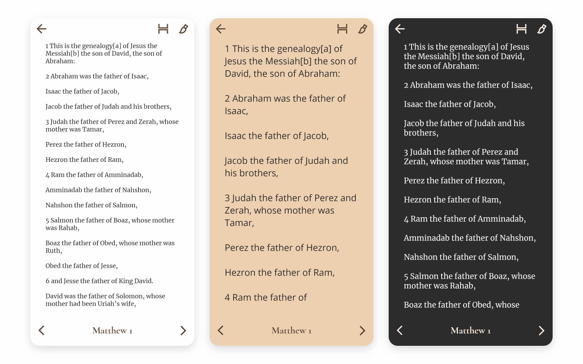
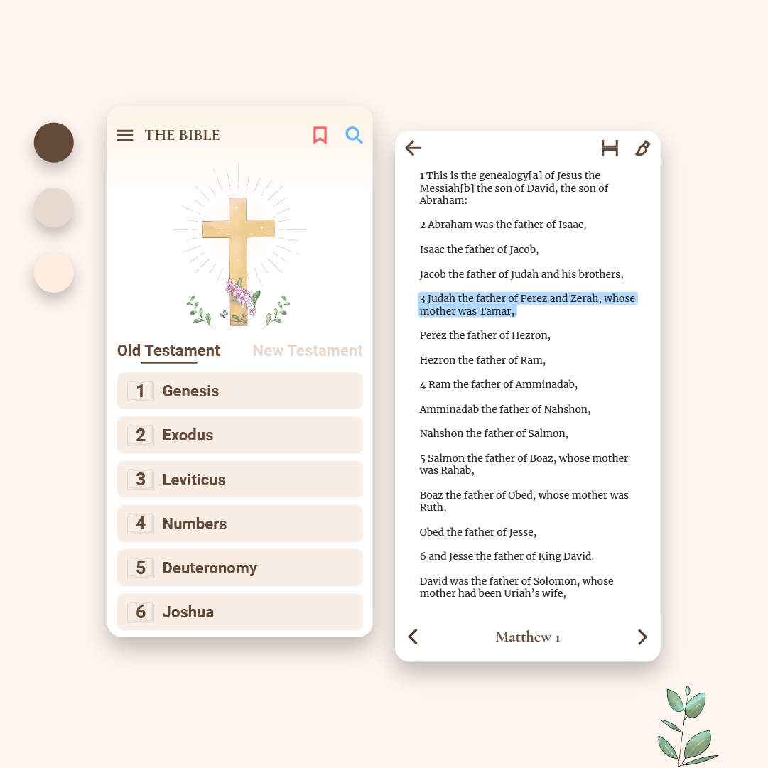
Colors & Typography: The UI of the Bible only relies on 3 colors, as well as one light and one dark gray. We want to keep the reader simple, yet with character. For the fonts, there are one sans serif and one serif for both the UI and the reader. For the reader, we picked Open Sans, a familiar font with great readability and Merriweather for the serif counterpart. On the UI side, the serif font is picked for its design, instead of its readability and is used only for the headings.
 
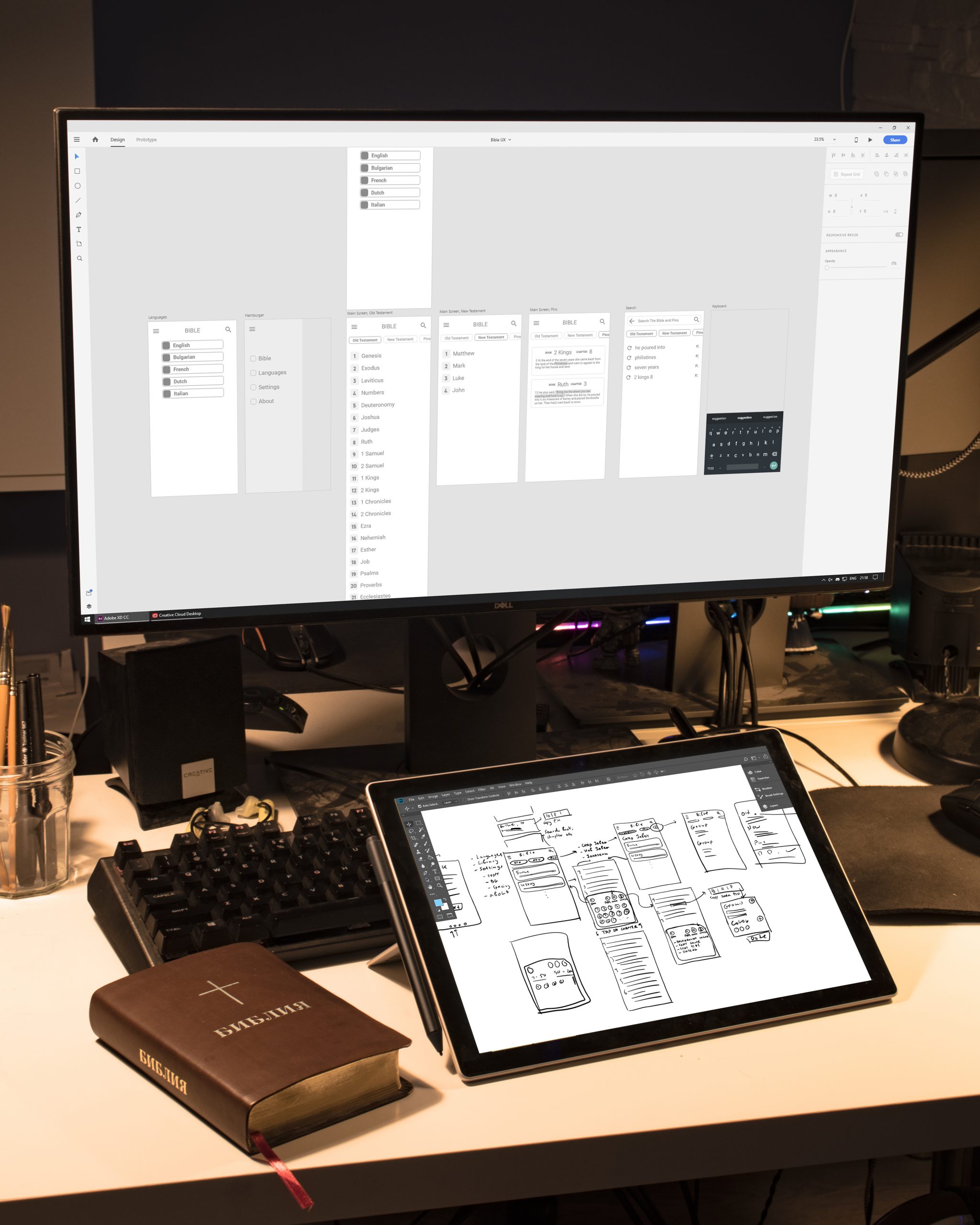
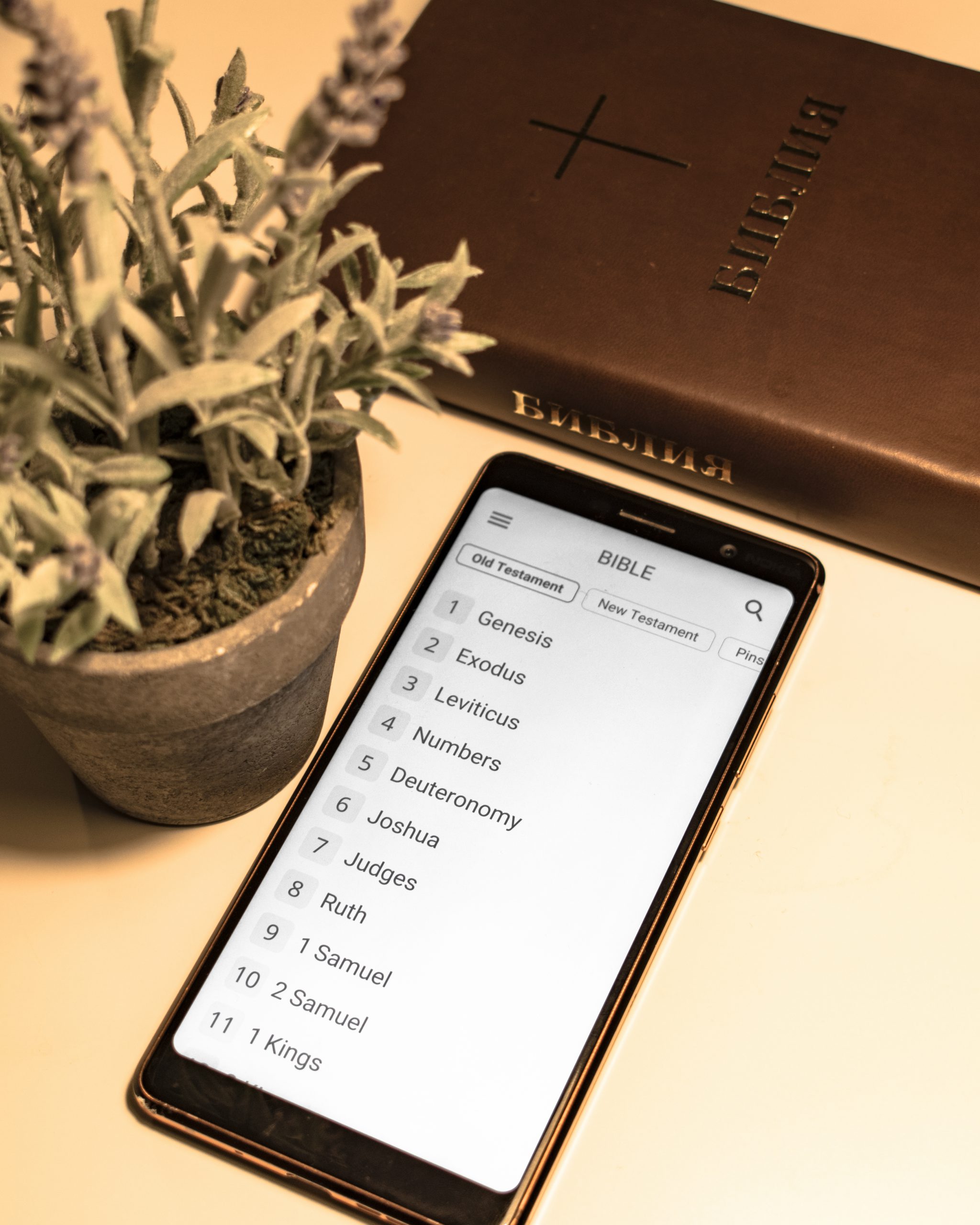
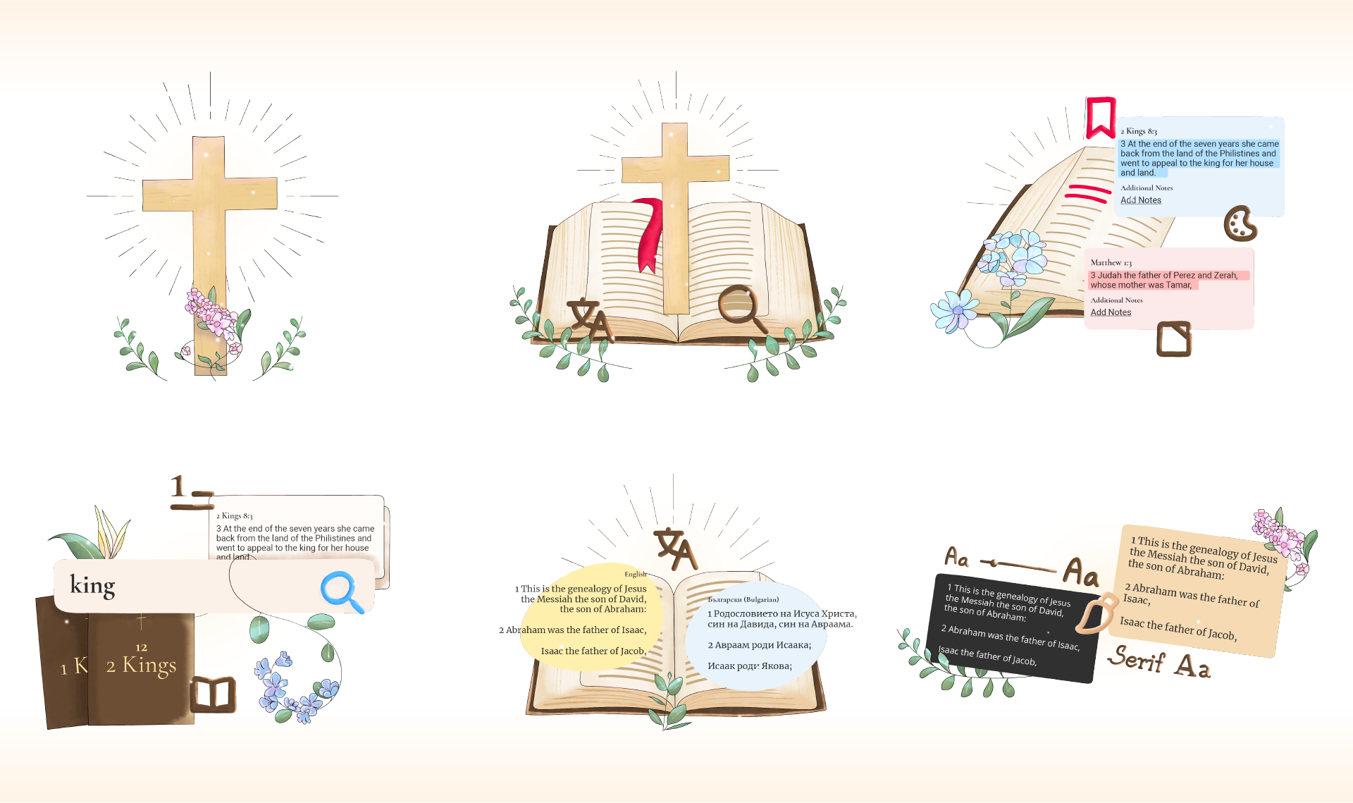
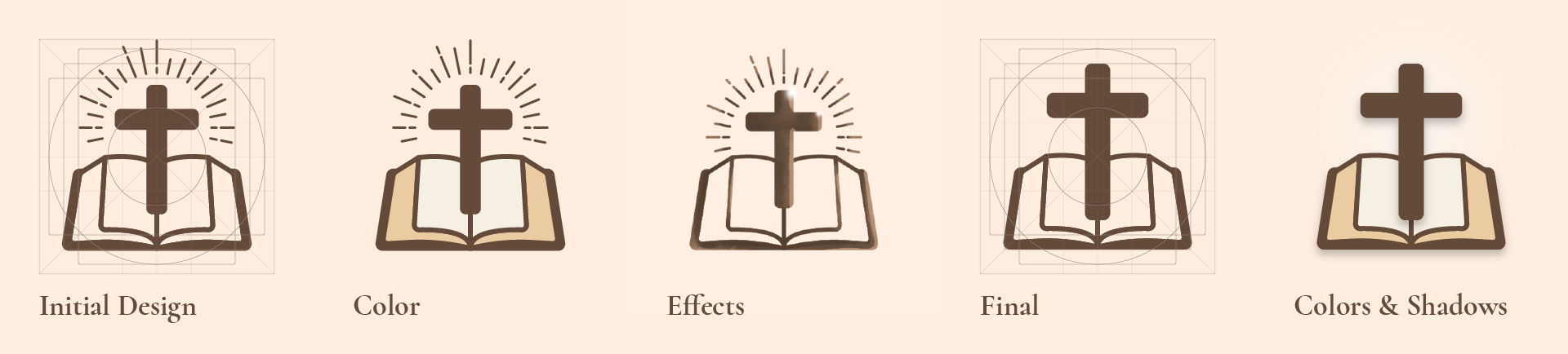
Style: The most distinctive elements from the design system are the fields – text boxes, buttons. They blur the elements behind them and leave a smooth shadow to increase the contrast. The overall style is meant to be elegant and smooth, without many sharp edges.

Design System

Bible Reader App Design System

UI Design

Bible Reader App UI Splash
Bible Reader App UI Home
Bible Reader App UI Reader
Bible Reader App UI Settings

Preferences

Bible Reader App UI Reader Preferences

Prototype

UI Motion

Illustrations & Graphics

Most of the illustrations are used for the splash screens when starting the app. Their purpose is to help the user get into the features of the app easier. Elements from the illustrations are also used in the respective screens of the features.
 
The illustrations are digitally hand drawn in Fresco with its watercolor brushes.

Icons

Bible Reader App Icons

Illustrations

Bible Reader App Illustrations Sketch
Bible Reader App Illustrations Graphics
Bible Reader App Illustrations
Bible Reader App Illustrations Elements
Bible Reader App Illustrations Sizes

Timelapses

App Icons

The icon started as a simplified version of the main illustration from the UI. The first usability tests were with outline only, then with color and some outline effects. The results were not that impressive, as the main elements of the icon were hard to identify from a distance. That lead to further simplification of the icon and the final version.
Bible Reader App Icon Concept
Bible Reader App Icon
Bible Reader App Icon Mockup

Technology

The app is developed for Android Devices with Xamarin.​​​​​​​
Bible Reader App